
View model monitoring results in Grafana#
You can deploy a Grafana service in your Iguazio instance and use Grafana Dashboards to view model monitoring details. There are five dashboards.
In this section
Note
You need to train and deploy a model to see results in the dashboards. The dashboards immediately display data if you already have a model that is trained and running with production data.
Model monitoring Overview dashboard#
The Overview dashboard displays the models endpoints of the selected project. Only deployed models with Model Monitoring enabled are displayed. Endpoint IDs are URIs used to provide access to performance data and drift detection statistics of a deployed model.
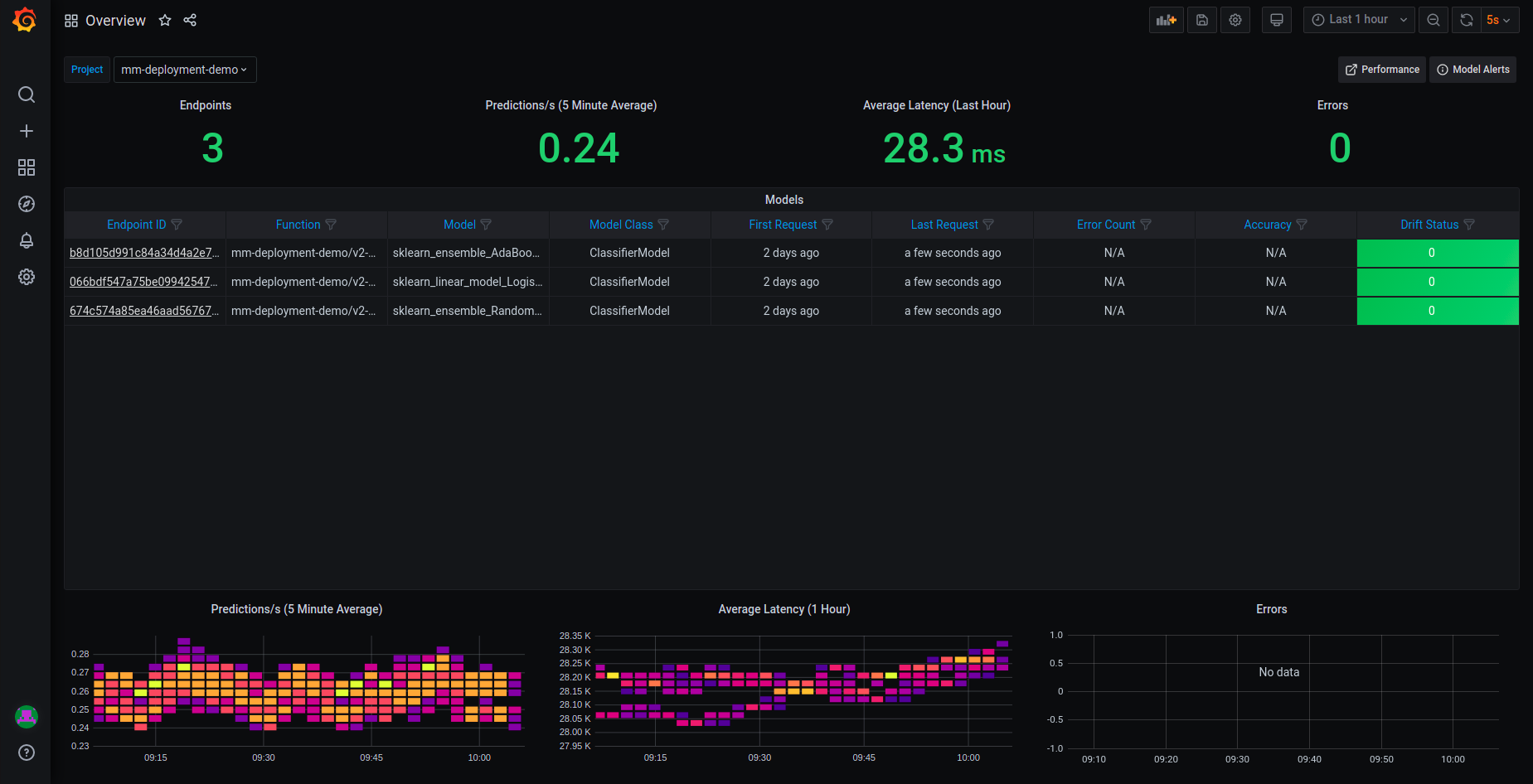
The Overview pane provides details about the performance of all the deployed and monitored models within a project. You can change projects by choosing a new project from the Project dropdown.
The top row of the Overview dashboard is a summary of:
The number of endpoints in the project
The average predictions per second (using a 5-minute rolling average)
The average latency (using a 1-hour rolling average)
The total error count in the project during the selected time period
The central table presents details about the endpoints in the project:
Name — the model endpoint name.
Endpoint ID — the model endpoint ID. Press it to drill down to the performance details.
Function — the MLRun function to access the model.
Model Class — the implementation class that is used by the endpoint (e.g.,
SKLearnModelServer).Error Count — the total number of errors: includes prediction process errors such as operational issues (for example, a function in a failed state), as well as data processing errors (for example, invalid timestamps, request ids, type mismatches etc.).
Sampling Percentage — the sampling rate percentage. By default (100), all events are sampled.
Drift Status — no drift (green), possible drift (yellow), drift detected (red).
The table does not reflect the selected time range, it just displays the model endpoints status in the last 24 hours.
The graphs at the bottom are:
Heat map for predictions
Heat map for average latency
Time series chart that displays errors by model endpoint over time
See How to Read a Heat Map for more details.
How to read a heat map#
Heat maps are used to analyze trends and to instantly transform and enhance data through visualizations. This helps to quickly identify areas of interest, and empower users to explore the data in order to pinpoint where there may be potential issues. A heat map uses a matrix layout with colour and shading to show the relationship between two categories of values (x and y axes), so the darker the cell, the higher the value. The values presented along each axis correspond to a cell which is color-coded to represent the relationship between the two categories. The Predictions per second heatmap shows the relationship between time, and the predictions per second, and the Average Latency per hour shows the relationship between time and the latency.
To properly read the heap maps, follow the hierarchy of shades from the darkest (the highest values) to the lightest shades (the lowest values).
Note
The exact quantitative values represented by the colors may be difficult to determine. Use the Performance Dashboard to see detailed results.
Model monitoring Details dashboard#
The Details dashboard displays the detailed real-time performance data of the selected project and model endpoint. Use the dropdowns to change the project and/or model endpoint.
The detailed model performance data can be used to fine tune or diagnose potential performance issues that may affect business goals.
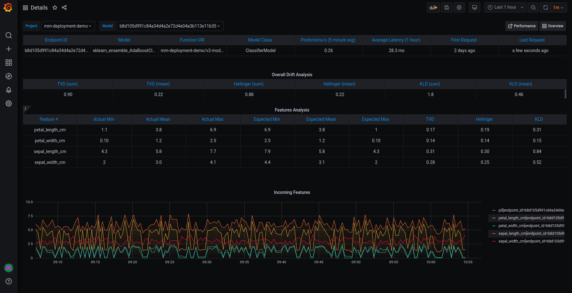
The top row presents the same data as in the Overview dashboard. The graphs are:
Drift analysis — a calculated result named General Drift from the histogram data drift application. The drift value is calculated as the average of Total Variance Distance and Hellinger Distance. The default thresholds are 0.5 for potential drift and 0.7 for detected drift. For more information about the default drift analysis, see Model monitoring.
Overall drift analysis by time — the application metrics, including Total Variance Distance, KL Divergence, and Hellinger Distance.
Incoming features — the performance of the features in the selected model endpoint based on sampled data points from actual feature production data. The graph displays the values of the features in the model over time.
Model monitoring Performance dashboard#
The Performance dashboard displays performance details in graphical format.
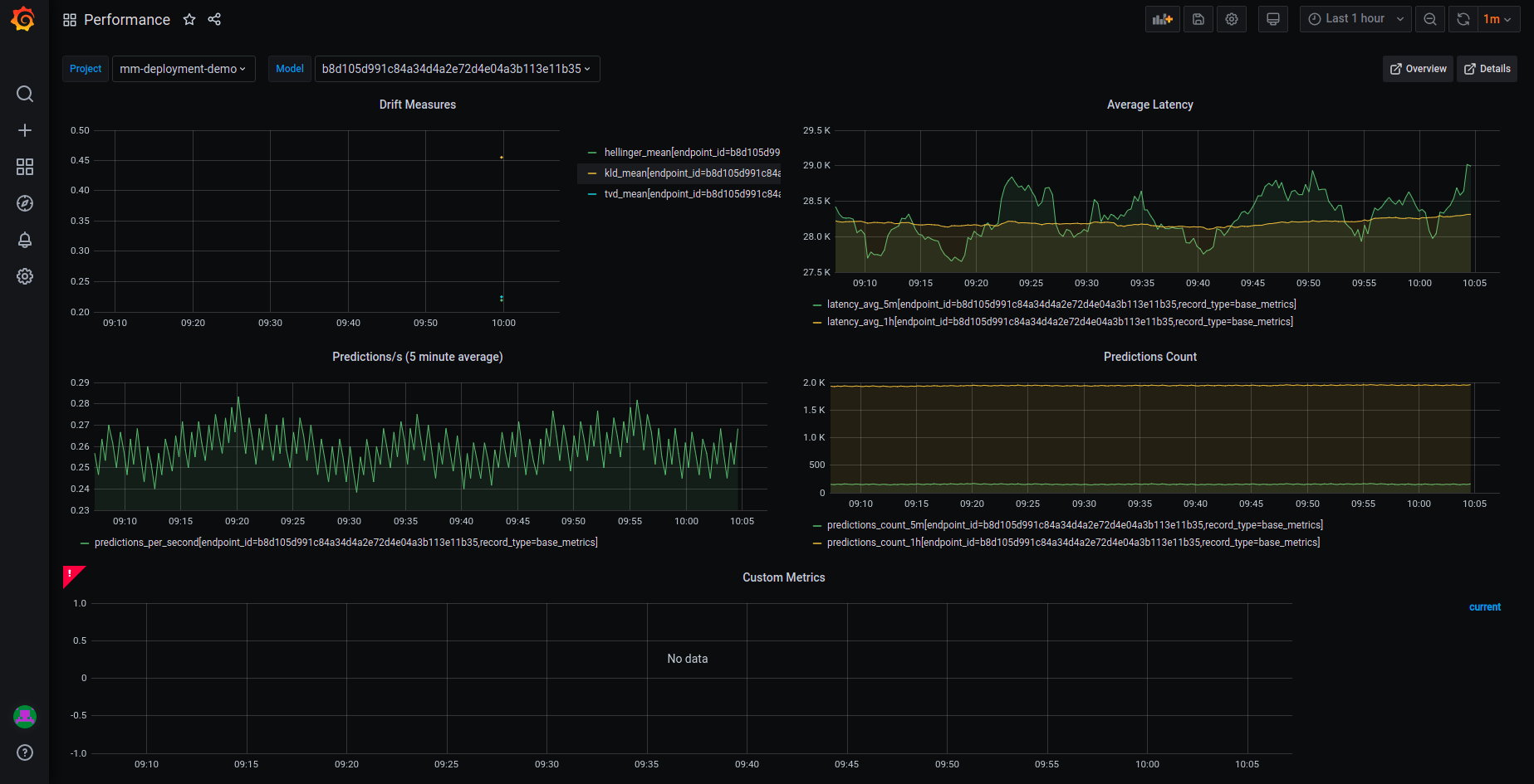
This dashboard has five graphs:
Predictions/s — the average number of predictions per second, over 5-minute intervals (rolling)
Average Latency — the average latency over time in both 5-minute and 1-hour intervals (rolling)
Errors — the number of errors over time
Predictions Count — the number of predictions over time in both 5-minute and 1-hour intervals (rolling)
Custom Metrics — custom metrics defined in the serving function
Model monitoring Applications dashboard#
The Applications dashboard displays details of the selected metric.
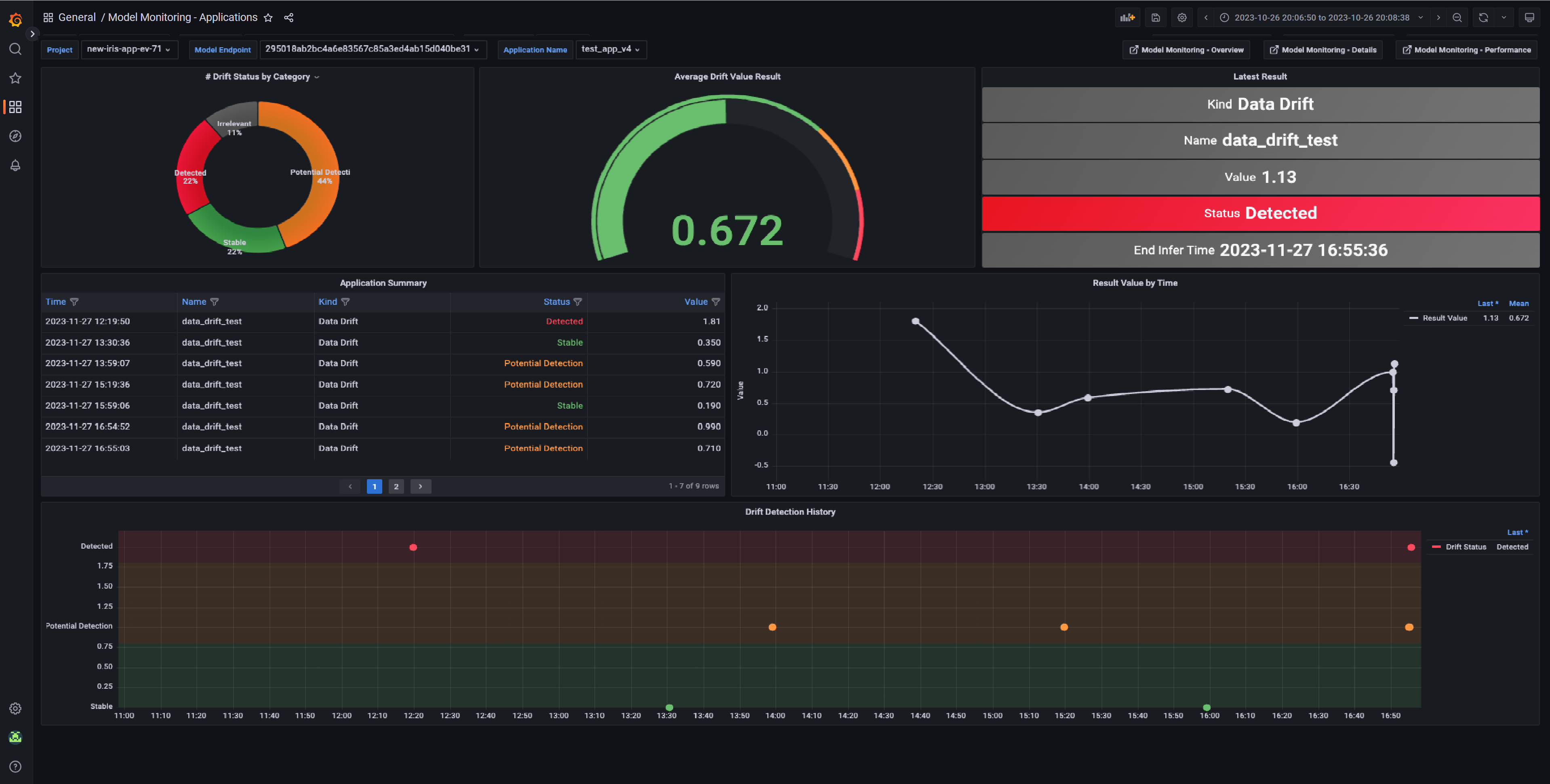
Predictions — the estimated number of predictions pushed to the selected model endpoint.
Metrics — the number of times the selected metric was calculated for the selected model endpoint.
Average Value — the average value of the selected metric for the selected model endpoint.
Latest Result — the most recent metric calculation within the selected time range. If the selected metric is an application result, the chart also displays its status and type.
Metric Summary — a table summary of the metric results including the start and end infer time, and the numerical value. If the selected metric is an application result, the chart also displays its status, type, and extra data.
Metric Value by Time — the metric value over time. The time value is based on the end of the infer time window.
Configuring Grafana datasources#
Verify that you have a Grafana service running in your Iguazio AI Platform.
If you do not have a Grafana service running, please follow Creating a Service to add it to your platform.
When you create the service: In the Custom Parameters tab, Platform data-access user parameter, select a user with access to the /user/pipelines directory.
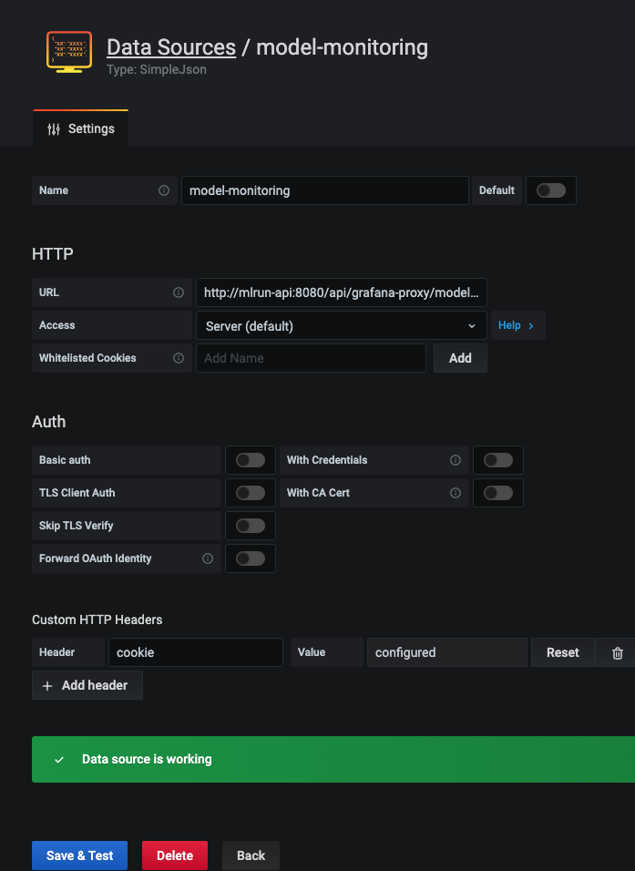
In addition, you will have to add access keys to your model-monitoring data source:
Open your Grafana service.
Navigate to Configuration | Data Sources.
Press model-monitoring.
In Custom HTTP Headers, configure the cookie parameter. Set the value of
cookieto:session=j:{"sid": "<YOUR ACCESS KEY>"}Press Save & Test for verification. You'll receive a confirmation with either a success or a failure message.
Configuring Grafana dashboards#
From Iguazio 3.5.3, the overview, details, and performance dashboards can be found under Dashboards | Manage | private. You can also import the latest dashboards versions by downloading them using the following links:
Iguazio 3.5.3 and higher
Iguazio up to and including 3.5.2
Upload dashboards to your Grafana service by:
Navigate to your Grafana service in the Services list and press it.
Press the dashboards icon in left menu.
In the Dashboard Management screen, press IMPORT, and select one file to import. Repeat this step for each dashboard.